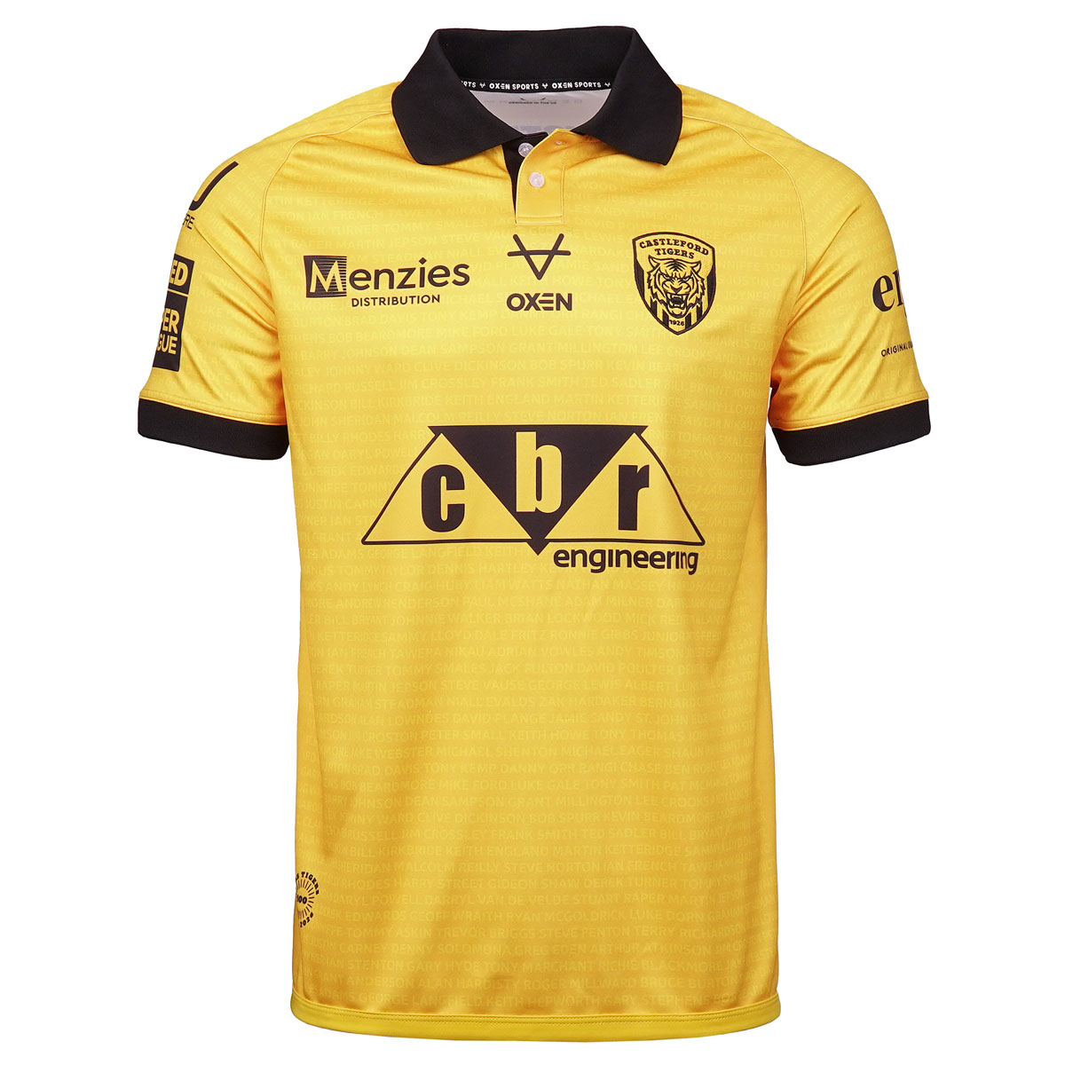
Very nice. The photo at the top of the page makes it look duster yellow but it’s not. It’s the right amber.
It’s the sponsors that stop it from looking amazing but without them, there wouldn’t be a shirt or team in reality and thanks to them for allowing their names logos in black outline. A lot of sponsors would want this logo in full and in colour.